Objective: To create an appealing poster design featuring a new drink idea/promotion for Starbucks, using Starbucks brand guidelines and brand consistencies. Then, from the first completed poster design, as a starting off point, create a 3-piece ad campaign that displays 3 different ideas that compliment each other and still showcase consistent Starbucks color palette and font choices.
Solution: Sketched some ideas using basic shapes and gradients. Created drink illustration with colored pencil and scanned that image into Photoshop. Made further adjustments and edits with Adobe InDesign and Illustrator. For the ad campaign, ideas from the original brainstorming and sketches were continued, gradients and basic shapes were used to ensure consistency between all three posters. All three poster designs look related to each other while simultaneously looking unique and successfully showcasing different drinks and color palettes.
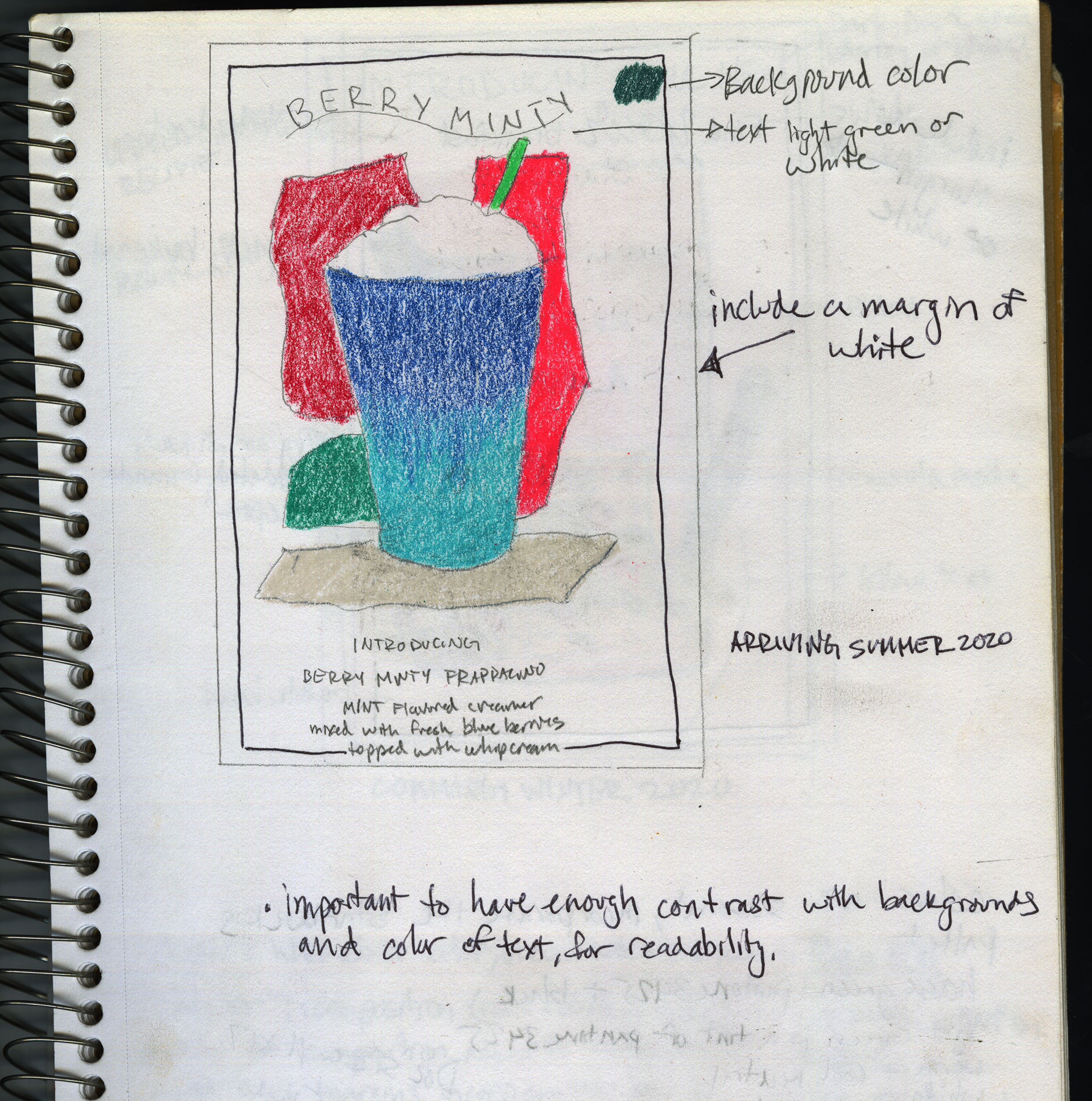
Brainstorming and getting ideas down on paper.
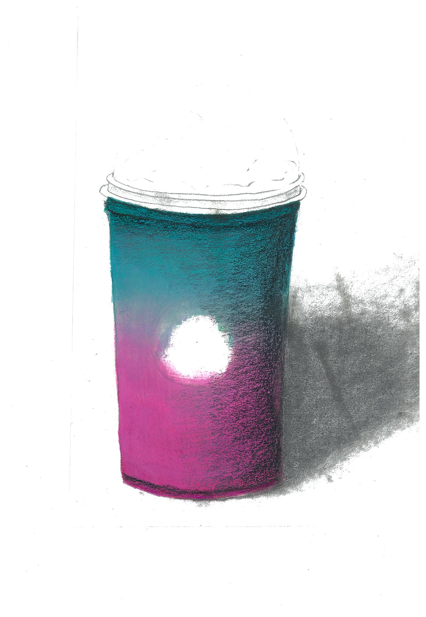
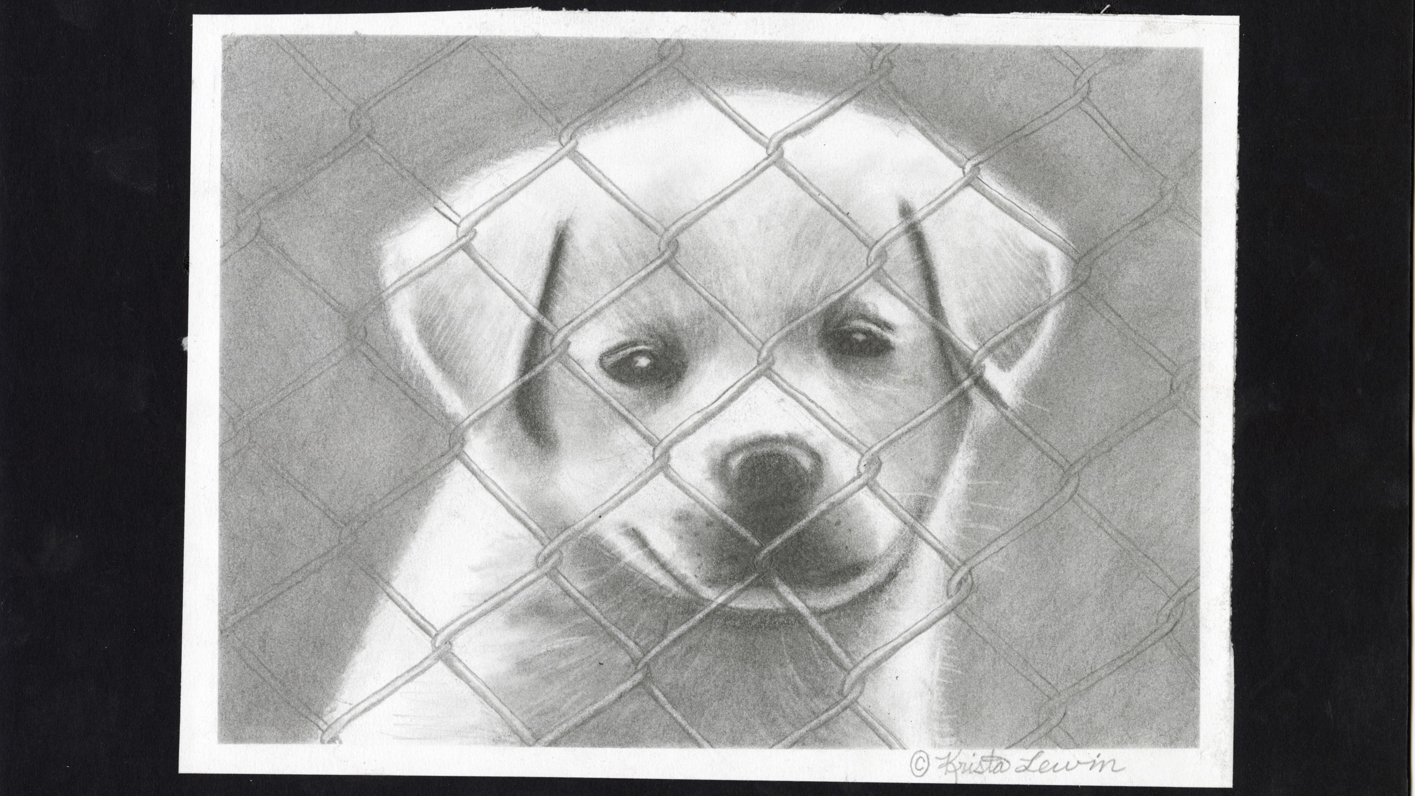
Colored pencil drawing that was scanned into Adobe Photoshop.

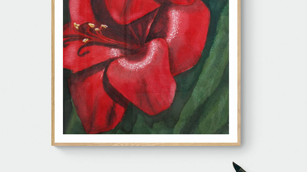
Another colored pencil drawing that was edited in Photoshop
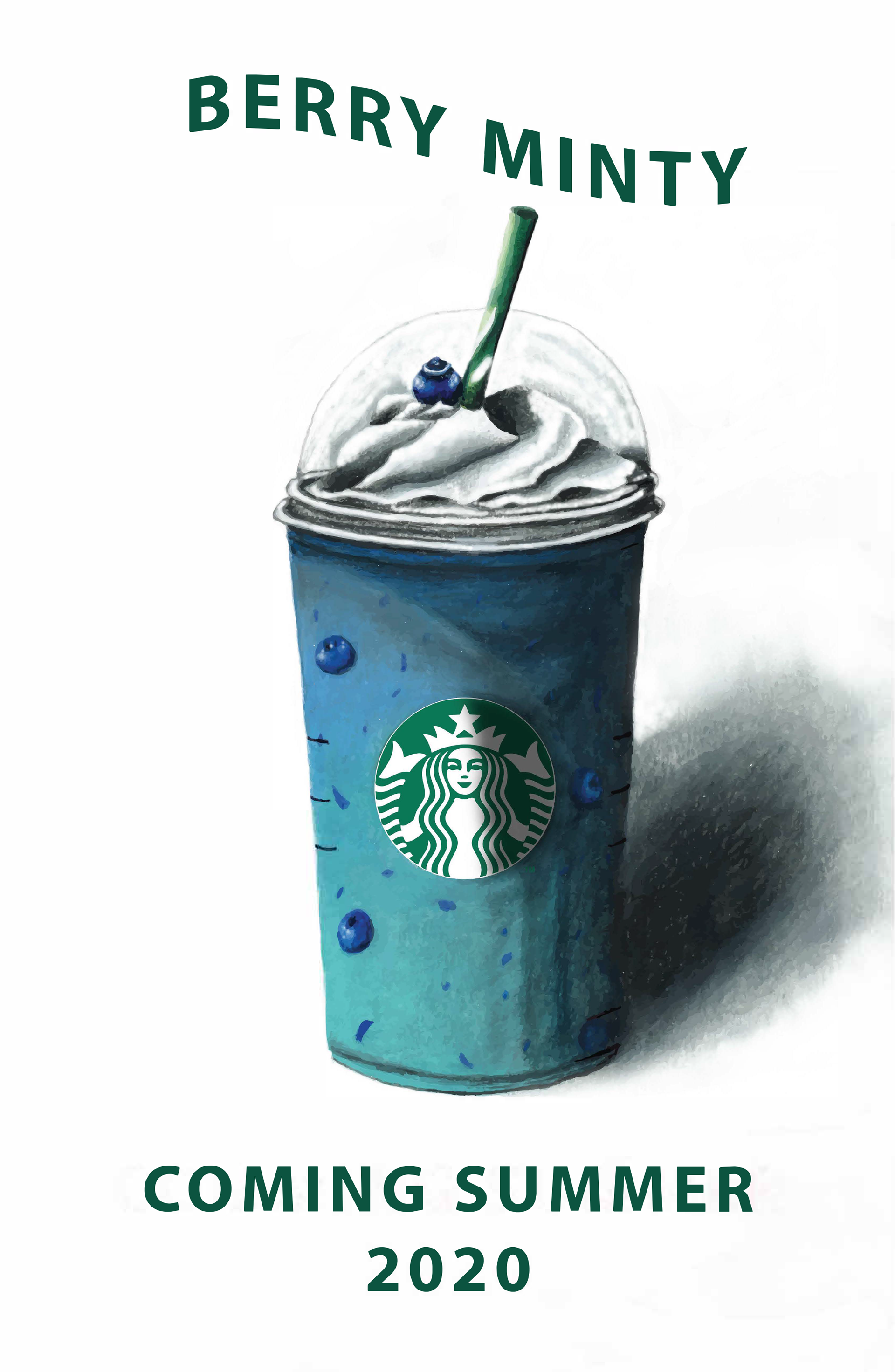
First of three initial poster designs.
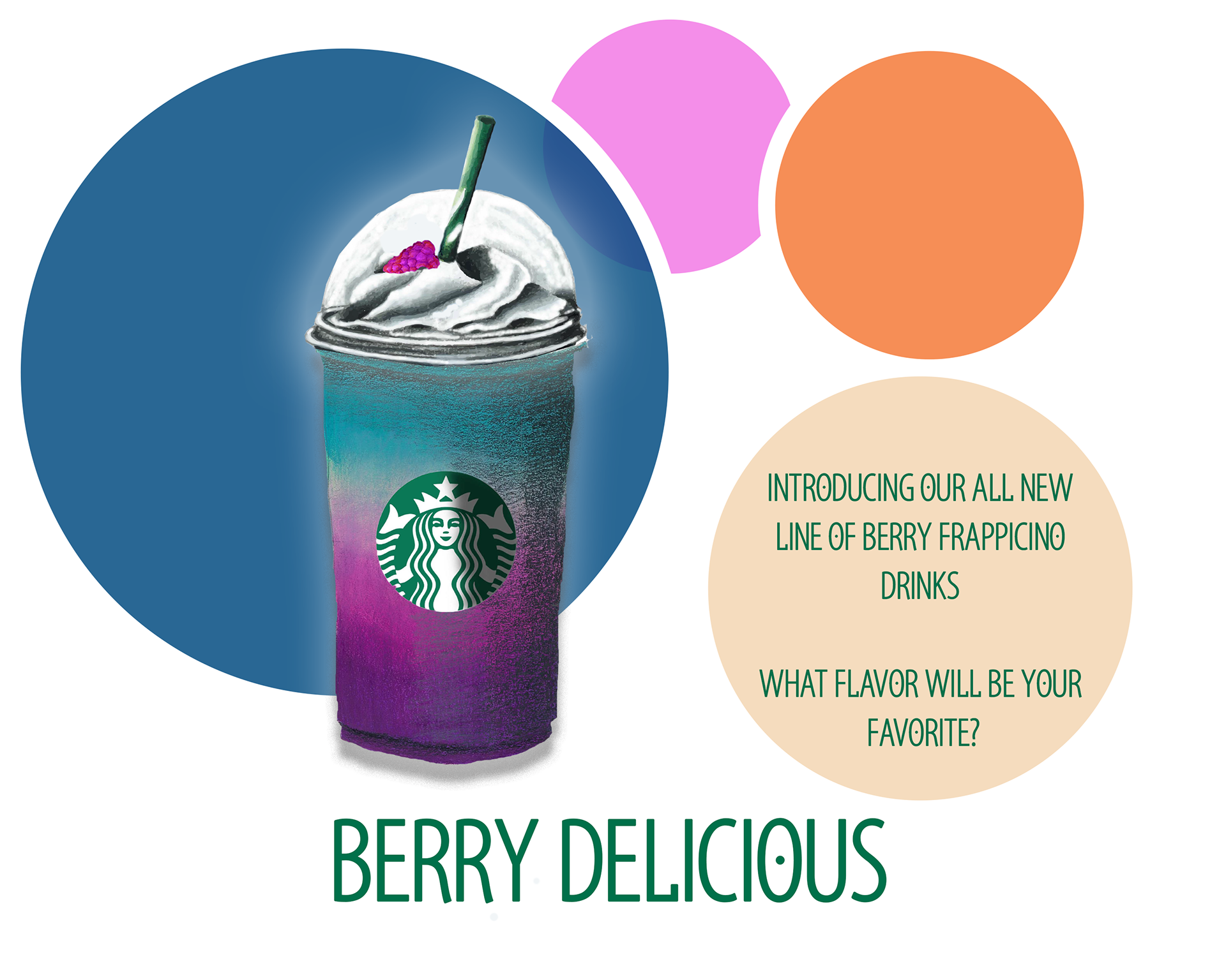
One of three final posters designed for a proposed ad campaign
One of three final posters designed for a proposed ad campaign
One of three final posters designed for a proposed ad campaign
All three posters together, that would make up my proposed ad campaign for
Starbucks
